Dark Mode doesn’t have dark purple color: While using toggle timer, dark mode doesn’t have dark purple color, instead it shows black and white themed dark mode.
Problem: Hi, I have been using toggle timer since long, I often encounter this problem sometimes. The inbuilt dark mode has a dark purple color of the calendar sheet but sometimes, it shows black and white themed dark mode, which can’t be changed. In the screenshot provided, toggle timer is opened on Zen browser but I’ve tried opening it in chrome and edge as well. Also have logged in their respective private mode (incognito) to check if the problem persists. Also, I’ve allowed all cookies in both the browsers to see if something changes. Still can’t find any solution over the internet. If anyone can help, it would be of great help to me. Thank you
I apologize, but we’ve removed the dark purple theme as part of our recent updates. We now offer a light theme and a dark theme. Sorry for any inconvenience this may cause!
@Support What is the reason for this change? Is it not possible to retain the Dark Purple theme as a separate theme? The new dark theme is very ugly and makes the app almost unusable on my computer. (I really liked the dark purple theme). If you are going to remove dark purple at least make the dark theme a true dark theme, the purple accents in some places but not others make it look quite bad. (or even allow us to create our own themes, i don’t know how much work this would take though) Love everything else about toggl though!
@support I just want to echo @aarnav here. Not to be too critical but the dark purple theme was great and the new dark theme is not so great. Light theme is better but I don’t like the calendar view:
I find both of the current themes: light and dark now to be too low contrast now on the timer/calendar view and the colors just don’t seem to work together. Dark purple theme was perfect.
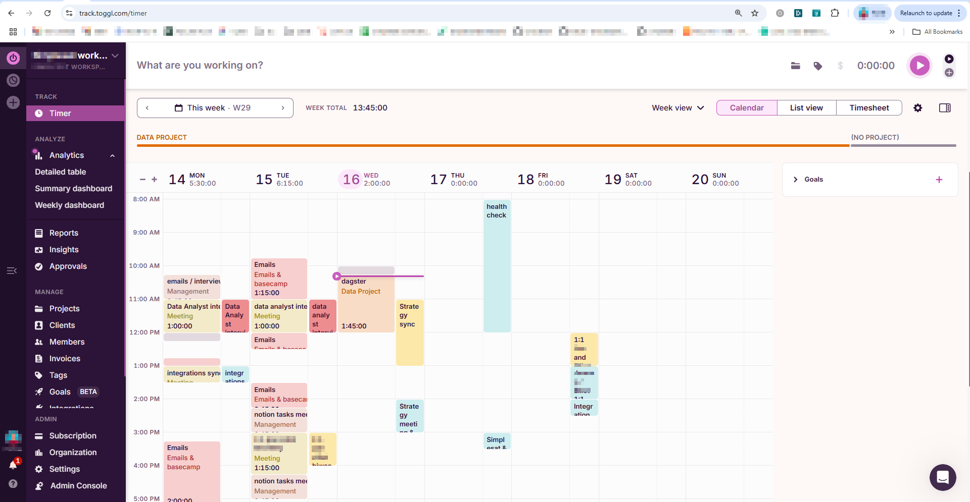
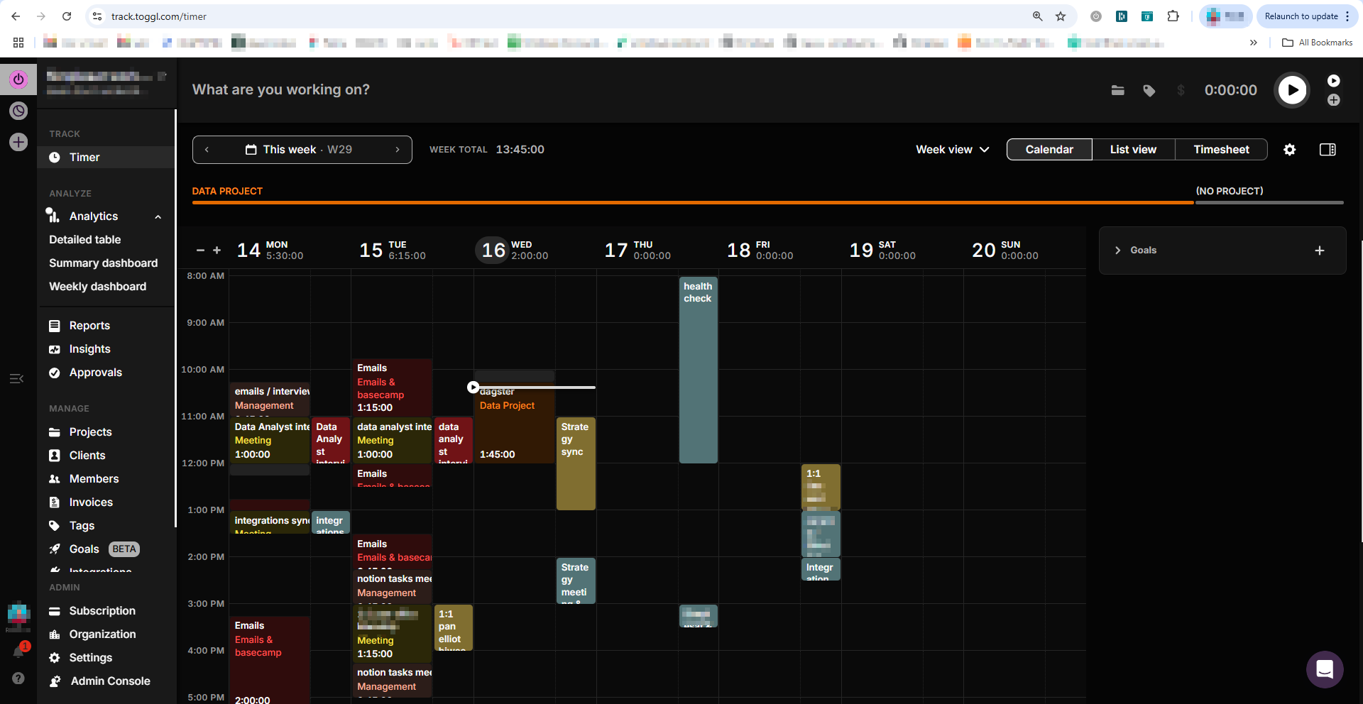
More specifically the light theme has good UI design for the sidebar and top bar menu but i find the calendar color design to be too soft-toned with not enough distinction between toggle events and google calendar events:
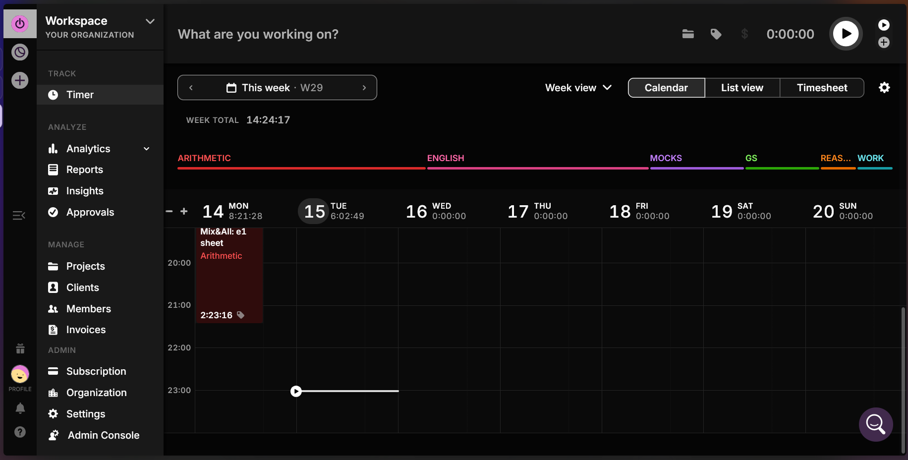
The dark mode has okay color design for the calendar view, but the UI makes me feel like I’m inside of a black and white silent movie in the 1920’s, searching in the dark for the right bright white line of text i need. It all blends together and it’s hard to see anything because there’s a lack of color:
When we compare directly with the light design we can see that we lost visual clarity and a sense of depth between different components on the page. We also reduced the number of different color indicators and instead mainly use white or different shades of gray reducing focus (most apparent on sidebar)
I second the above. I thought the dark mode had broken or something when it went all black. Even the fire emoji for completing a goal is in black and white.
It would be great if the colour scheme used CSS variables as I could then theme it how I wanted using my CSS changer plugin for chrome more easily. As it is targetting all of the different classes for things would take a lot of work to get the site looking good again in dark mode.
Hoping there will be a dark mode update sometime soon
Thank you for this detailed explanation. I hope it reaches the developers and designer’s team and they fix it. I’ve been using light mode now since I didn’t have any option. It has become somewhat familiar but nothing can replace that dark purple look. I hope they roll it out soon.
It looks like they removed all the colours as if a black and white picture of the 60’s is going on. Definitely not happy with the dark mode. I hope they fix it.
I want to echo what everyone else is saying: the new dark mode is super hard on the eyes, and I miss the old design. I would love to get it back. I will be using the light theme in the meantime. Honestly, I am not happy with it either.
I am using the web extension and I cannot figure out how to get rid of the black theme. Switching off “Enable Dark Mode” in the extension options does not do it.
Hi, adding my name to the list of folks asking to either bring back the purple or adjust the Dark mode to be more legible because it only just kicked in for me today. Even looking at one entry on the Timer screen is hard on the eyes because it just looks like you kept the colours the same without adjusting them for accessibility.