Post Title: Can I change the colour of the chart entries?
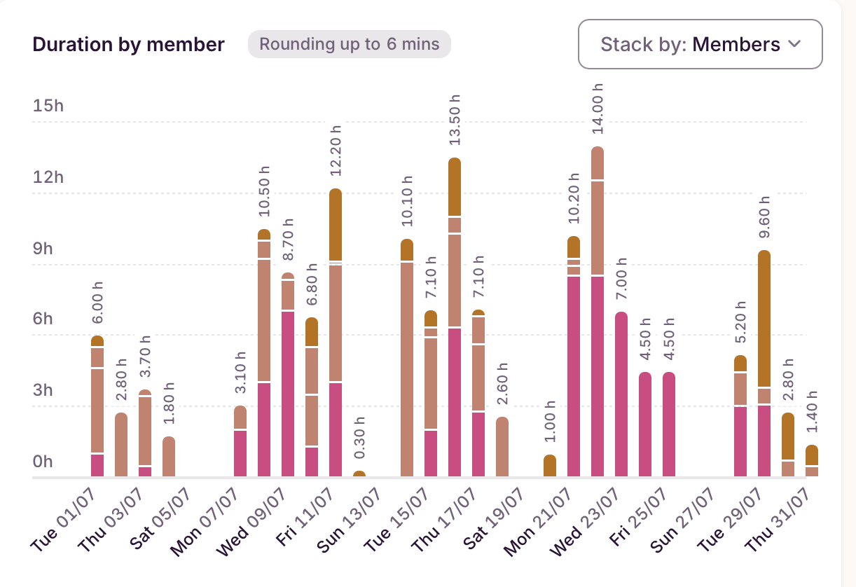
Your Question/Topic: In the new reporting overview, the colours used on the chart are incredibly similar - 4 of 5 are very close shades of brown, it makes it hard to distinguish at a glance. Can I change them, or can Toggl default to distinct colours rather than shades of the same colour?
Thanks in advance!